Adding Colour to a Mostly Neutral Wardrobe
A five-rung ladder from black, grey and navy towards colour, starting with what you already own. Each rung is small, and each is a fine place to stop.
A mostly neutral wardrobe is a sensible thing to own. Black, white, grey, navy, beige and brown go with one another almost without thought, which is exactly why they pile up. The cost is that getting dressed can start to feel like choosing between four versions of the same outfit.
Adding colour does not have to mean a bright coat and a change of personality. It can be done as a ladder: five small rungs, each using less colour than you might expect, and each a reasonable place to stop. Nothing below requires buying anything for the first two rungs, and possibly not for the rest.
Rung one: count the colour you already wear
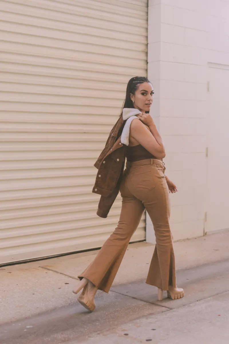
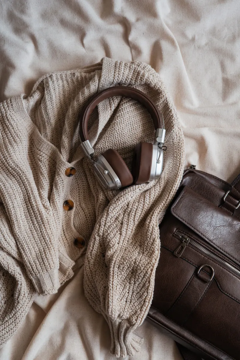
Most “neutral” wardrobes are less neutral than their owners believe. Blue denim is a colour. So are tan leather, khaki, olive, burgundy shoes, a camel coat and the rust lining of a jacket. Lay out everything that is not black, white or grey and look at it together in daylight.
Two things usually appear. The first is a lean: the pile is mostly warm (browns, olive, cream, rust) or mostly cool (blues, blue-greys, crisp white). The second is one colour you seem to have chosen more than once without noticing. Both are useful. A new colour that shares the wardrobe’s lean will find partners straight away, and the repeated colour is the obvious one to build on.
Rung two: put colour at the edges
The edges of an outfit are the neck, the wrists, the ankles and whatever you carry. Colour here is small in area and easy to remove, so it is a low-stakes place to practise.
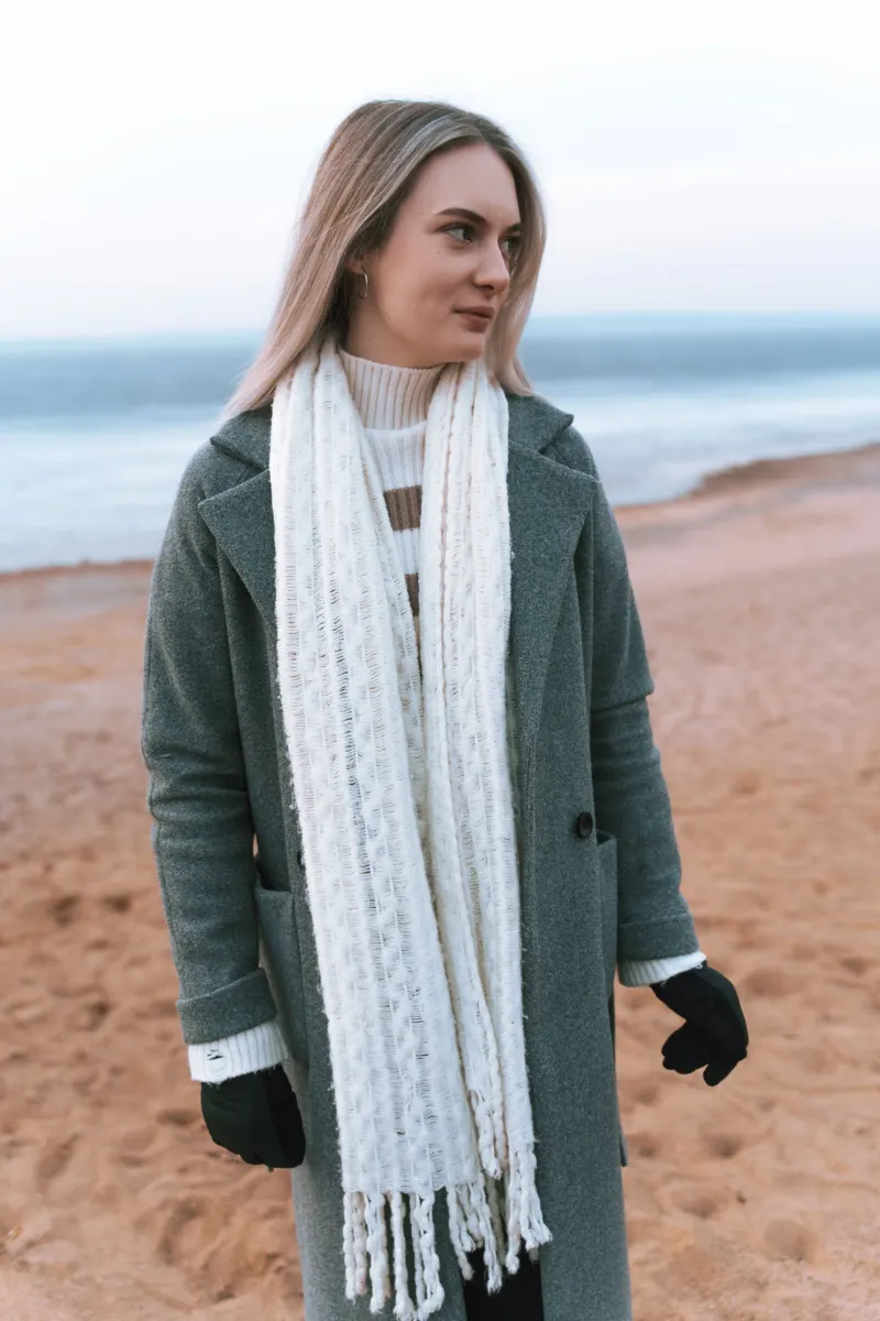
Try a week of one coloured edge per day with otherwise neutral clothes: green socks with grey trousers and black shoes; a red scarf with a navy coat; a blue shirt collar and cuffs showing under a grey jumper; a coloured watch strap or a bright tote. A scarf is the most adjustable of these because the amount on show can be changed during the day, and how to use a scarf without overcomplicating an outfit covers the ways of wearing one.
At the end of the week you will know two things: which colour you were glad to see in the mirror, and whether you prefer it near your face or far from it.
Rung three: swap one neutral for its deeper neighbour
Some colours behave almost like neutrals because they are dark and slightly muted: burgundy, forest green, deep teal, rust, mustard, chocolate, aubergine. Each sits close to a neutral you already wear. Burgundy and chocolate can do the job of black; forest green and teal the job of navy; rust and mustard the job of tan or camel.
So take an outfit that works and replace exactly one piece with its deeper neighbour. The jumper is usually the easiest, because knitwear in strong colours is common and sits next to the face, where a change is most noticeable.
The one-piece swap
An all-neutral outfit with a single garment changed for a deep colour of similar darkness.
- Pieces
- Grey wool trousers, a white T-shirt, black boots, a charcoal coat, and a forest-green crew-neck jumper where a navy or black one would normally go.
- Swaps
- Burgundy in place of green for a warmer result. In summer, the same idea with a rust or olive T-shirt under a beige overshirt. If the jumper feels like too much, start with the same colour in a knitted hat.
- The detail
- Keep everything else quiet. One coloured piece among neutrals looks chosen; the neutrals are the frame.
Rung four: wear one colour twice
A single coloured item can look like an accident. The same colour appearing in two places looks like a plan. The second appearance can be very small: a burgundy jumper and burgundy socks; a green jacket and the green stripe in a scarf; a blue shirt and the blue of a bag.
The two do not need to match exactly. Two depths of one colour, such as a pale blue shirt with a navy jacket or an olive overshirt with a sage T-shirt, give a softer version of the same idea, and it is a short step from there to dressing in one colour family from top to bottom. A simple guide to wearing tonal colours picks up at that point.
Rung five: two colours together
When one colour among neutrals feels normal, a second can join it. There are two broad ways to pair colours, and they feel quite different.
Neighbours. Colours that are close to one another, such as blue with green, rust with mustard or burgundy with pink, sit together quietly. The outfit reads as one mood with some variation in it. This is the easier of the two.
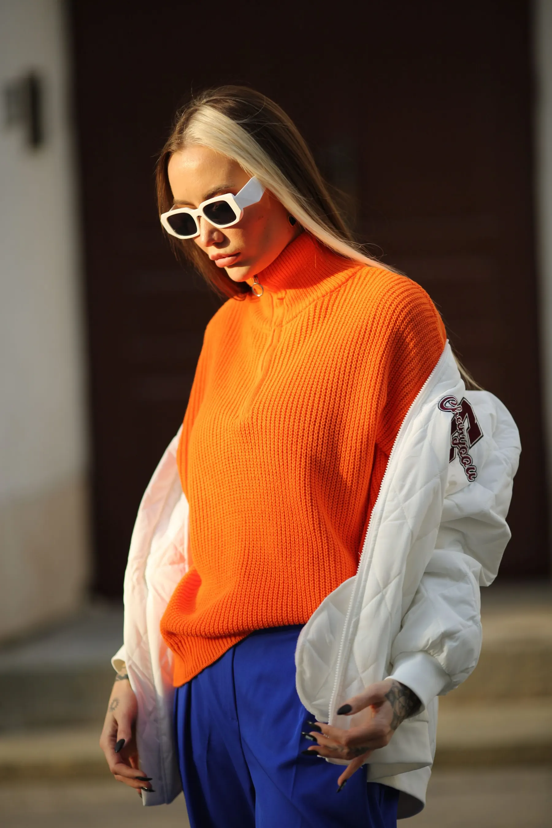
Opposites. Art teaching uses the term complementary colours for pairs that contrast with each other more strongly than any others; Tate’s glossary of art terms notes that such pairs sit opposite each other on a colour wheel and that, placed side by side, each makes the other look brighter. The pairs it names are red with green, blue with orange and yellow with violet. In clothes that brightening effect is the thing to manage. Equal amounts of two strong opposites are loud. A large area of one with a small touch of the other, such as a navy suit with a rust tie or a blue denim jacket with a small orange scarf, uses the same contrast in a much calmer way, and darker, more muted versions (navy and rust rather than bright blue and bright orange) are calmer again.
Mostly blue, a little rust
Two colours from opposite sides, one doing most of the work and the other kept small, with neutrals holding them together.
- Pieces
- Dark indigo jeans, a pale blue shirt, a navy jacket or cardigan, a rust or tan belt, brown shoes, cream or white socks.
- Swaps
- A rust scarf in place of the belt in cold weather. Grey trousers in place of jeans for work. For neighbours rather than opposites, change the rust for dark green.
- The detail
- The share. Roughly, the second colour takes up no more space than a belt, a scarf or a pair of socks.
If a colour does not work
When a coloured piece feels wrong, the cause is usually one of three things, and none of them is that colour is not for you. It may be the amount: move the colour to an edge, or wear it under a layer so that less shows. It may be the depth: a pale or bright version can feel harder to wear than a dark one of the same colour, so try the deeper neighbour. Or it may be the surface: to our eye a colour looks louder in a shiny fabric than in a matt one, and how different surfaces take the light is the subject of how to combine textures in a simple outfit.
There is also no obligation to climb any further than is comfortable. Plenty of people stop at rung two, with a drawer of good socks and one red scarf, and that is a complete answer.